
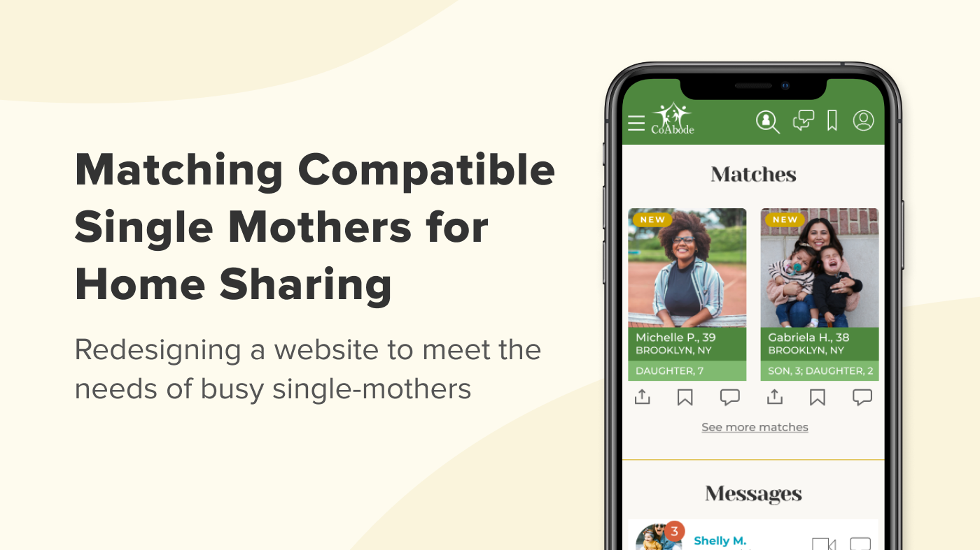
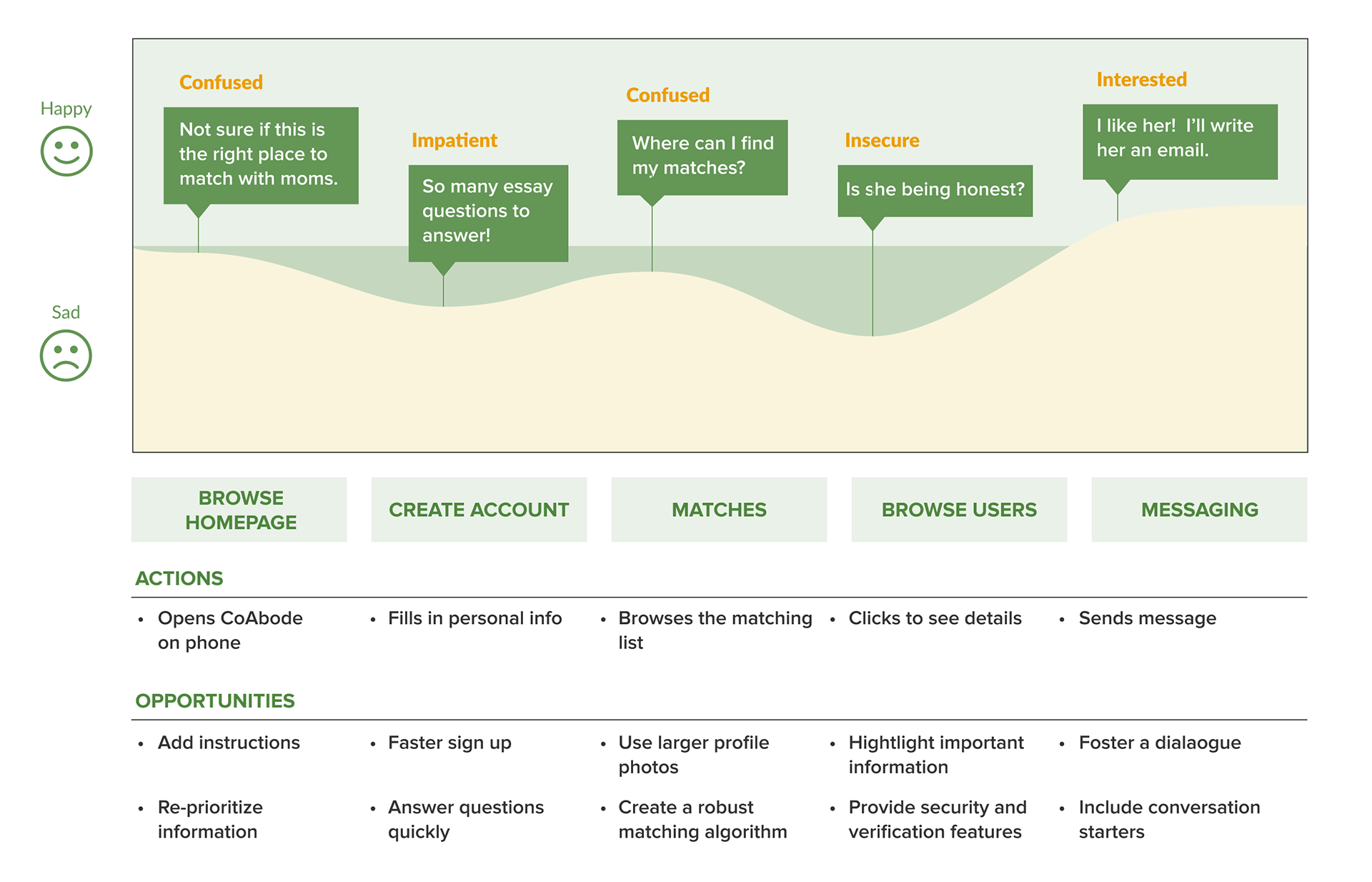
Homepage has an improved hierarchy and increased ability to scan information.
· 8 out of 11 sites ask new users to answer multiple-choice questions instead of essay questions for faster account creations
· Dating sites we studied use texting-style chat dialogues, not emails when sending messages
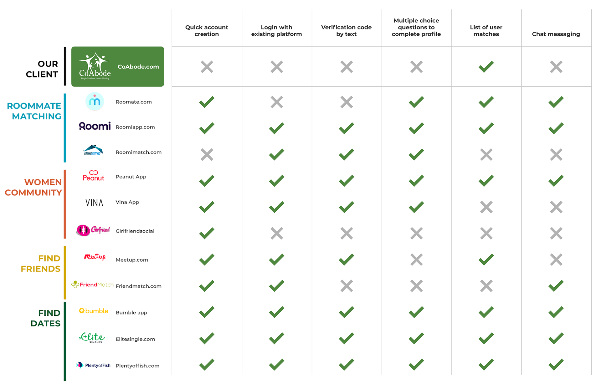
Comparative analysis for women communities and matching sites.
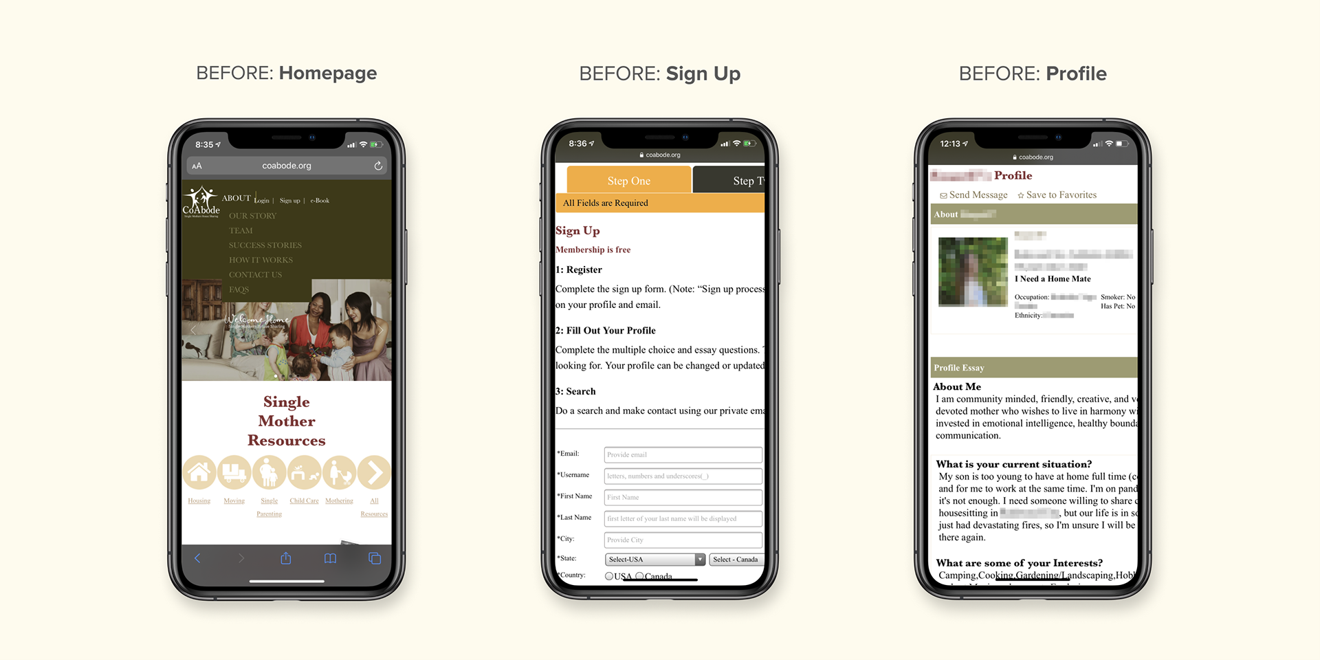
Homepage
· Text over images difficult to read
· No mention of housing matching
· No call to action
Sign up
· Button size is not mobile-friendly; too small
· A lot of text to read
· If you make an error, the form resets and the information is deleted
· Only one photo allowed
· Images are too small and proportions are skewed
· Chunks of descriptions are not scannable
Interviews with single moms
· Many single mothers have been impacted by lay-offs and are in between jobs
· The main hesitation against shared living for single mothers is concern over common parenting styles and priorities
· Single mothers who have used dating apps, appreciate the efficiency of the dating apps to fit into their demanding schedules/lifestyles
· Single mothers who had experience with CoAbode found the site to be purposeful but slightly limited with options
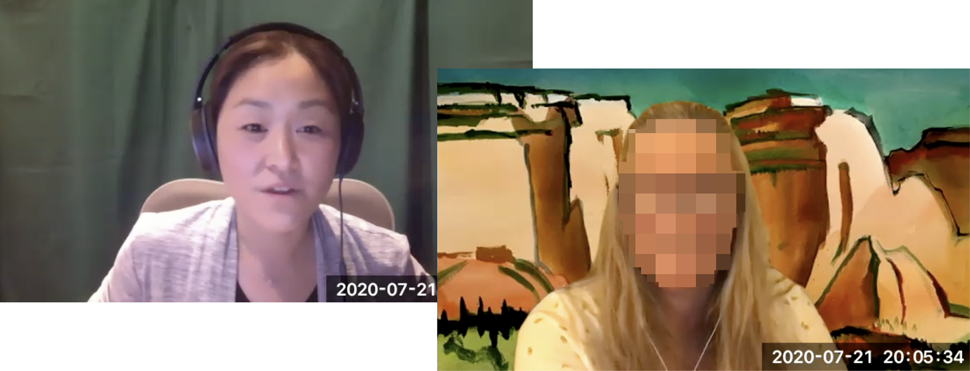
Monica interviews a single mother.
Through interviews, we learned that mothers are constantly pressed for time but they want to be extremely thorough when it comes to screening people who will have close contact with their children. We had to go back and ask, “how do we make this process faster while having an option to allow users to dig deeper they wanted to?” How do we speed up creating a profile for new users while still getting all the information that a single mom looking at the profile would want to get to make an informed decision about contacting or meeting a user?
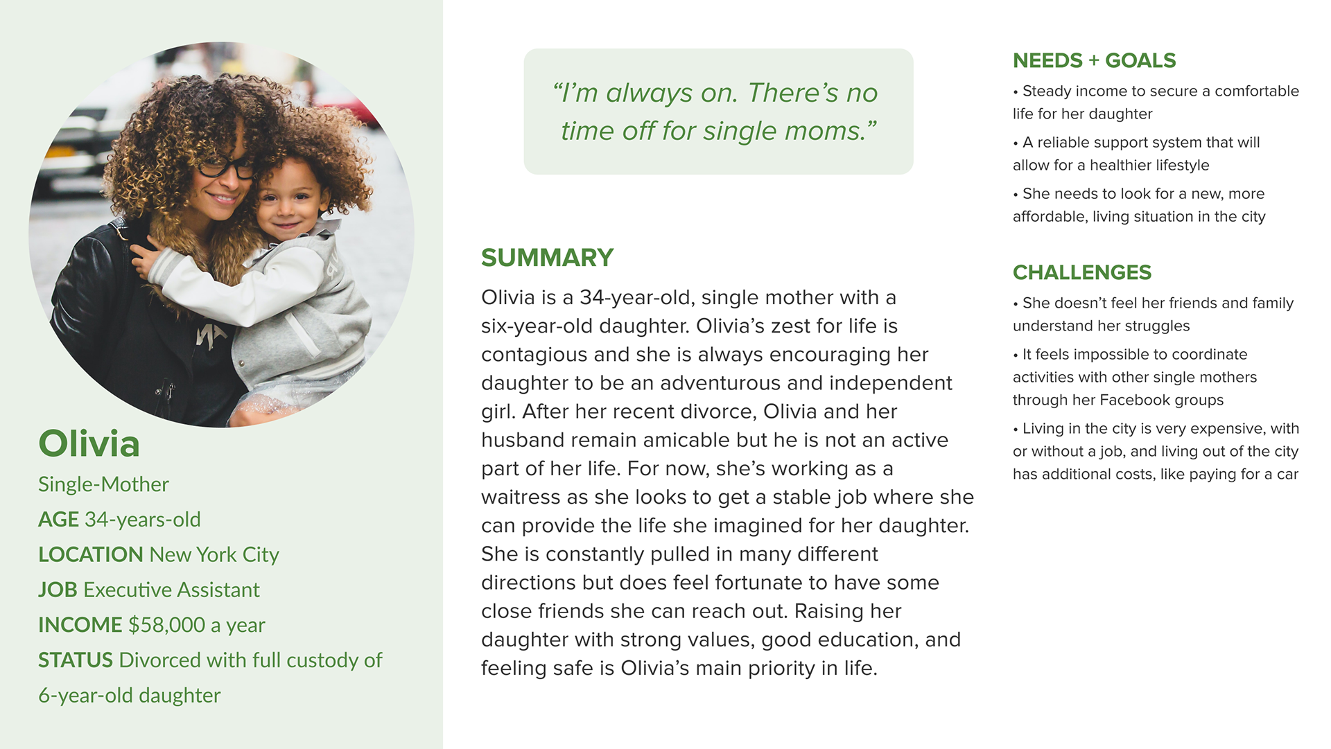
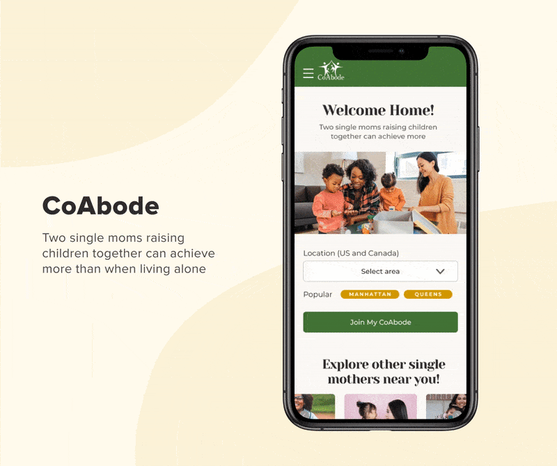
Olivia’s journey on CoAbode.com
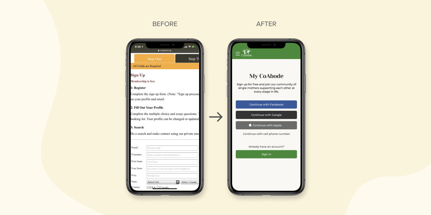
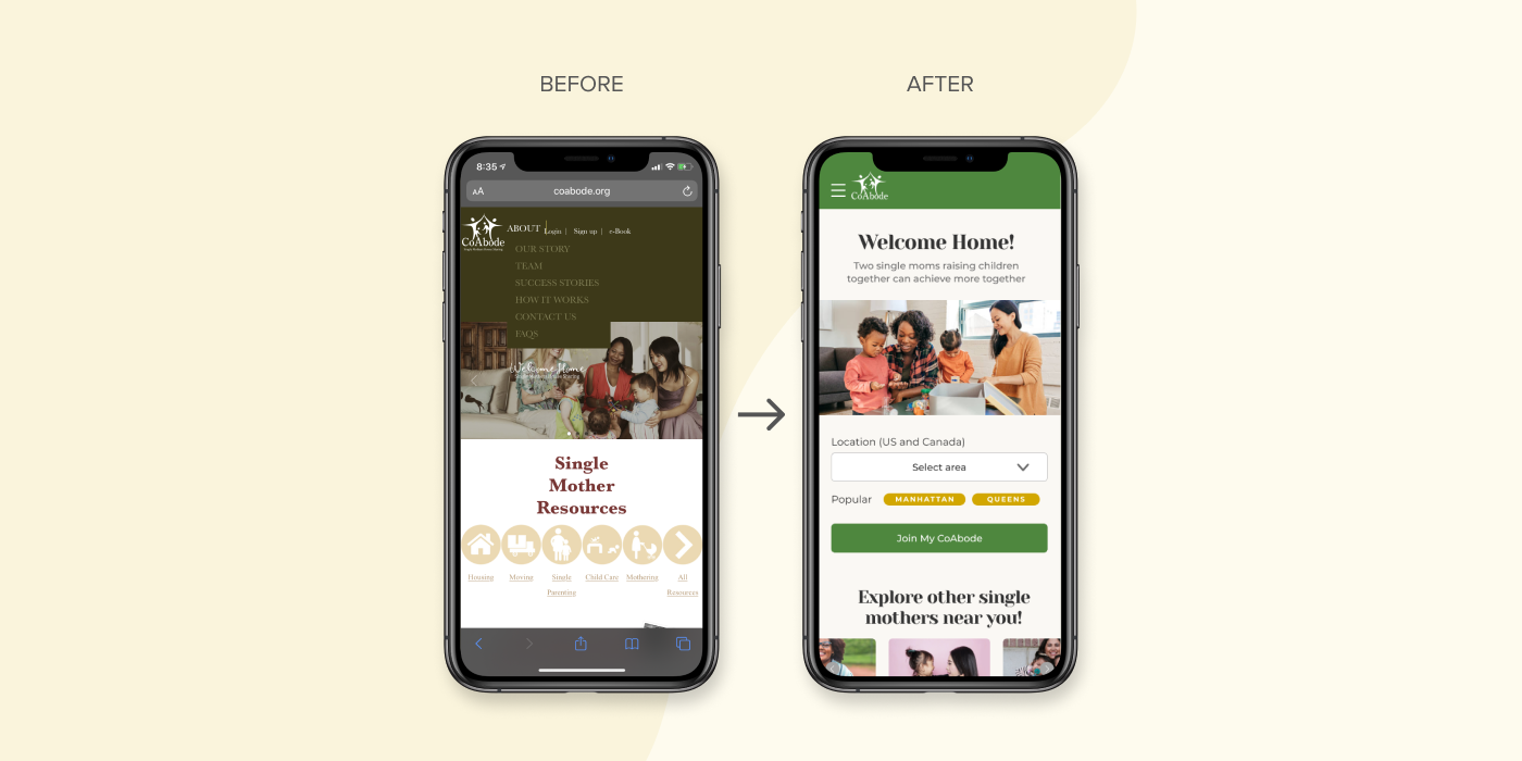
Before: Sign up screen wasn't optimized for mobile and felt overwhelming. After: Added ability to login with an existing platform.
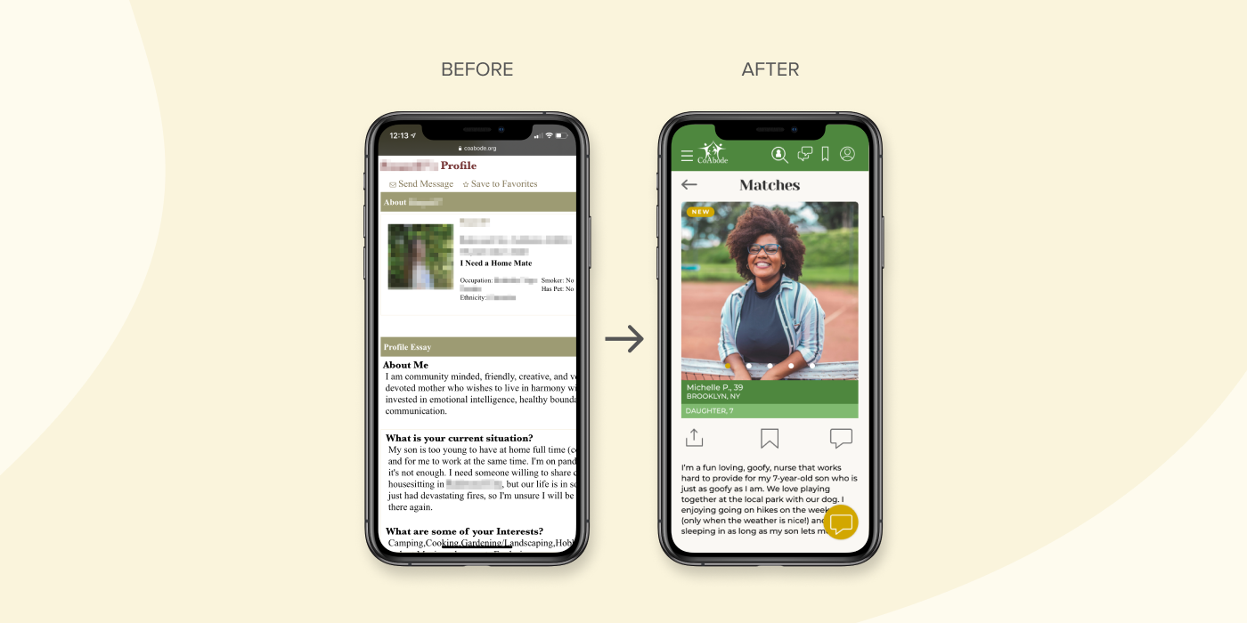
Before: Profiles were dense with text. After: Larger and multiple profile photos feel more engaging.
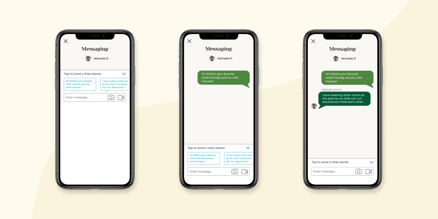
CoAbode users enjoyed the efficiency of dating apps so we utilized a messaging process they were familiar with.
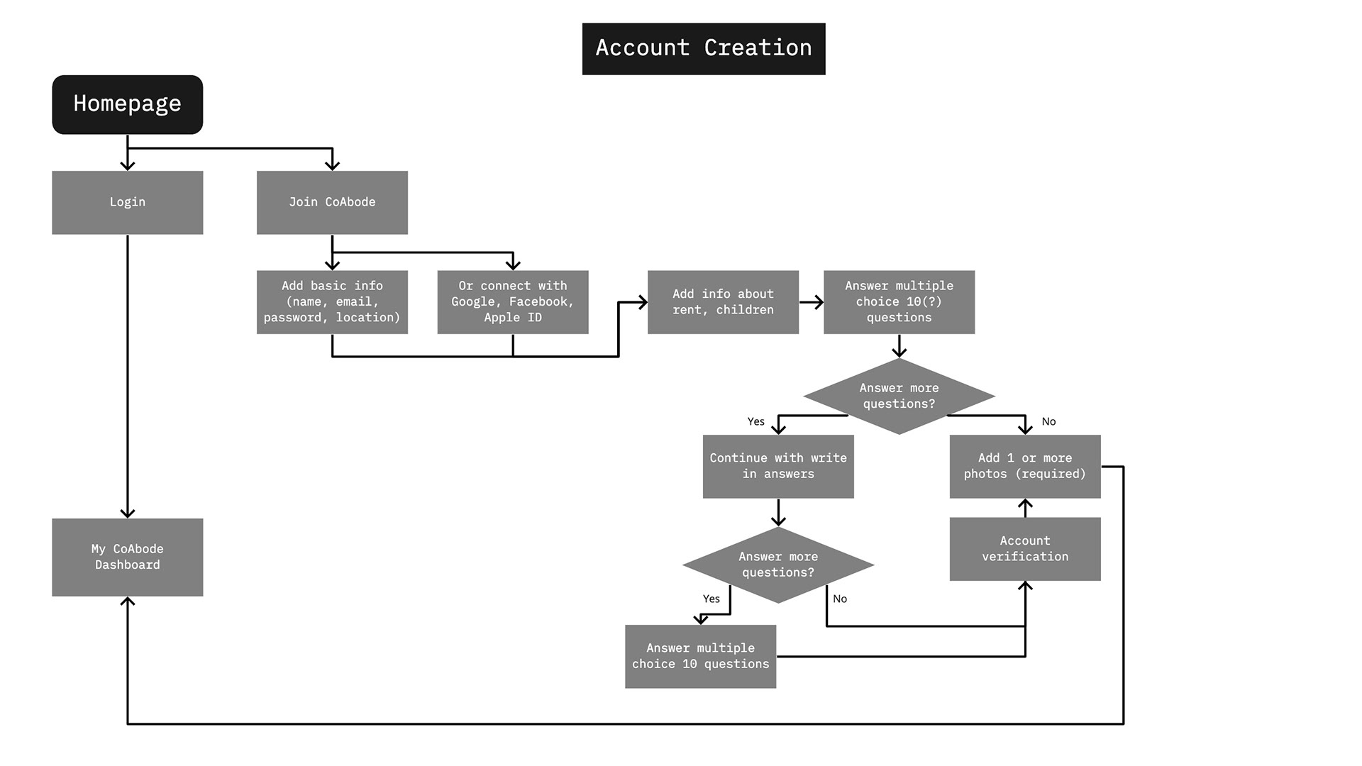
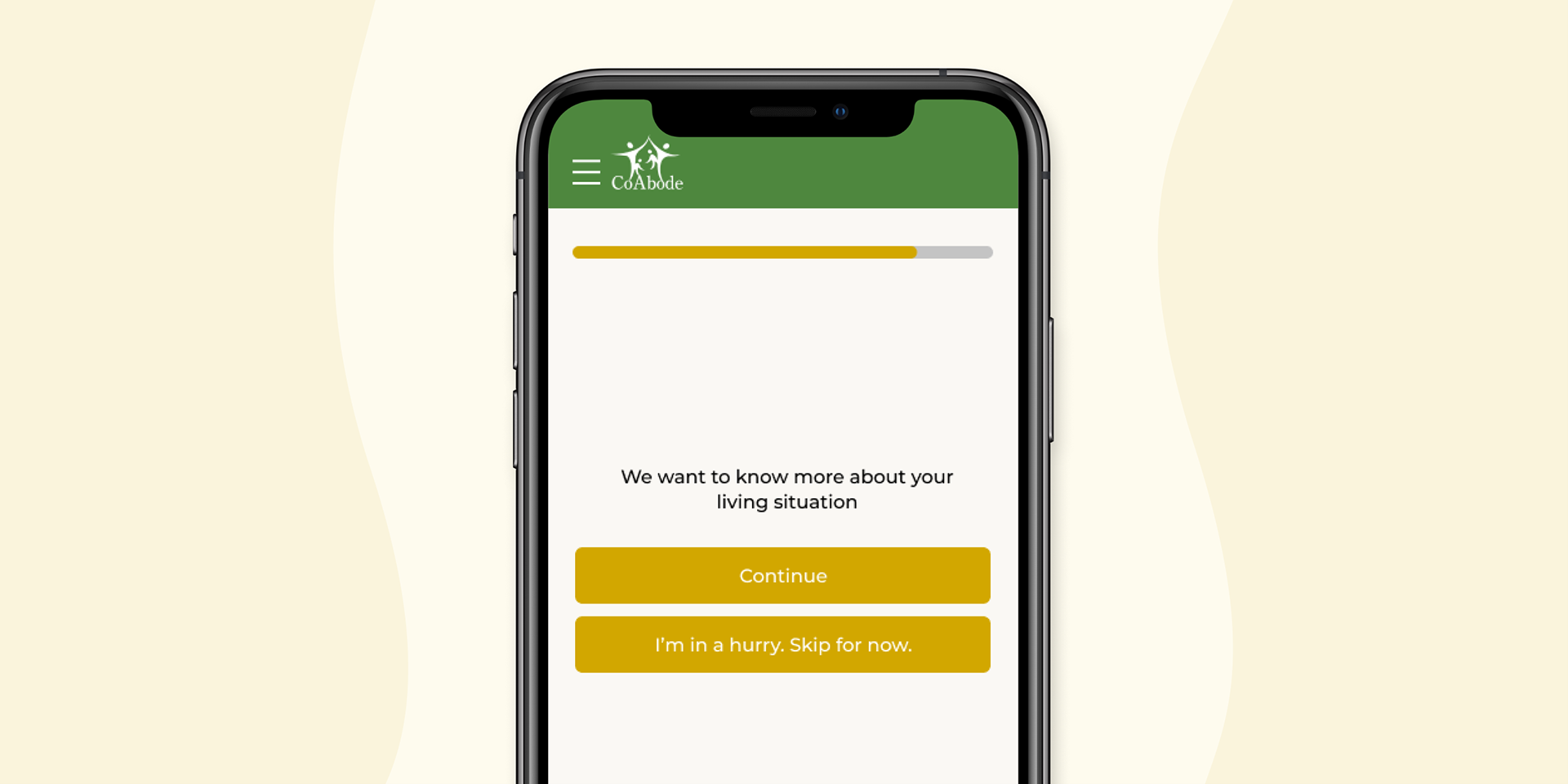
New account creation flow with more exits points so Olivia can leave the sign up early if she's short on time.
· Users found that scrolling through questions was tedious
· Users still found the profile section to be long and dense with content
· Users expected the completion of a question to jump you to the next page/question
· We added a collapsible feature to profile sections so Olivia can read only what is important to her or what she has time for
· We adjusted some copy to reflect positive and warm feelings. We created a sense of safety by requiring users to agree to a set of community guidelines
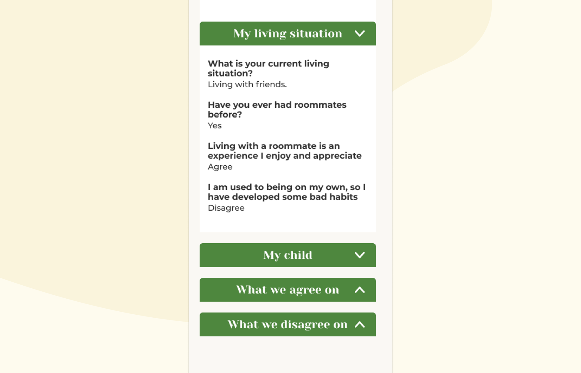
Collapsible profile sections so Olivia can easily scan for what she cares about most.
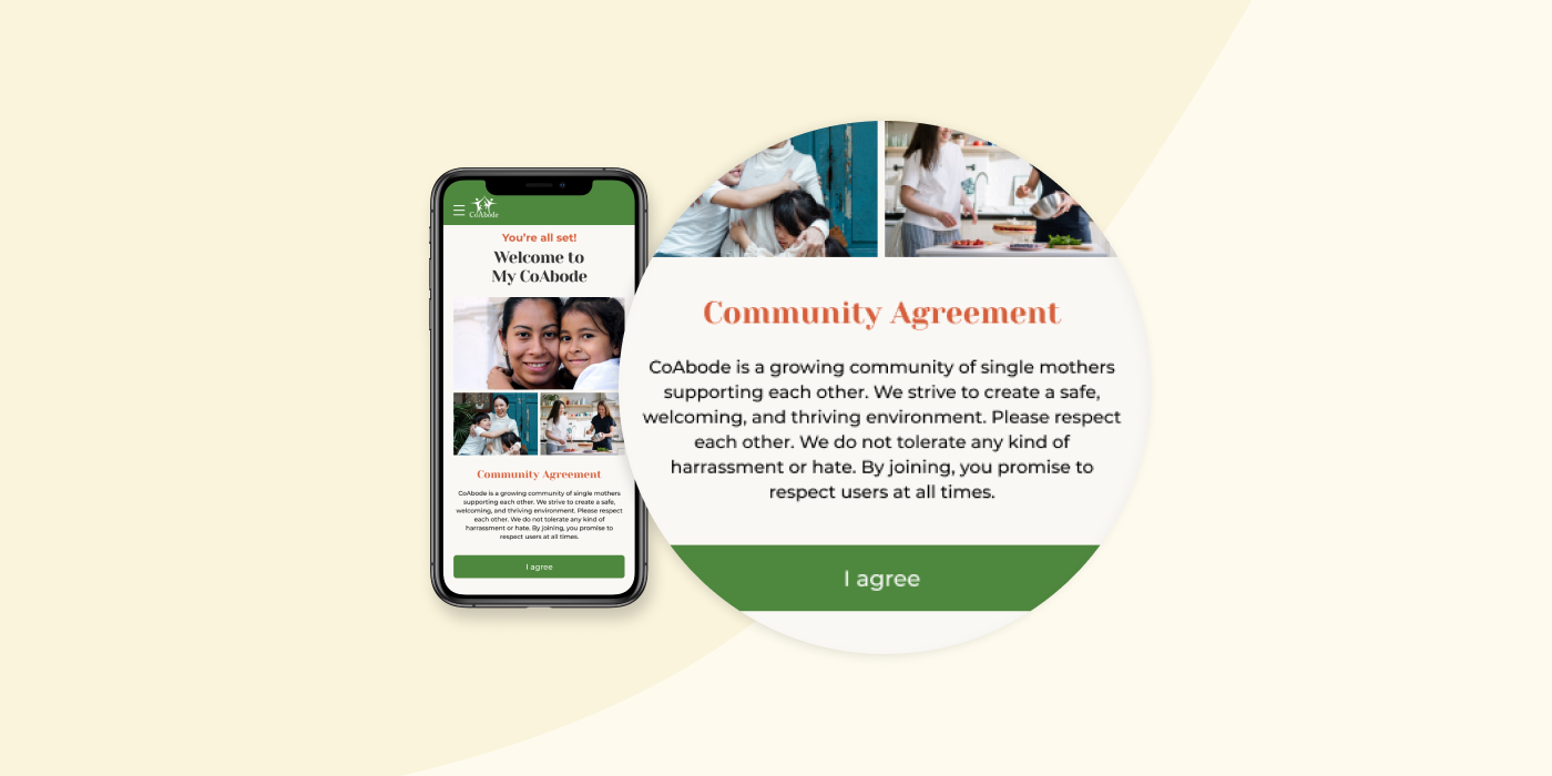
CoAbode users were worried about the kinds of people they might interact with so we created a community guideline agreement.